


Role
Lead UI Designer
Duration
2 Months
Tools
Figma, ChatGPT
Overview
Understanding the habits, struggles, and needs behind StudyTogether
StudyTogether is a responsive web app designed to help students who struggle with motivation, accountability, and isolation while studying. The platform connects users based on shared topics, enabling them to form study partnerships and build consistent habits together.
The Struggle
The Strategy
StudyTogether was designed to not just help students study — but to help them show up. Every feature was created to reduce friction, create connection, and make consistency feel effortless:
-
Matched users with partners based on shared goals
-
Simple session scheduler to build routine
-
Light social layer (posts, progress sharing) to boost engagement
-
Clean, distraction-free interface that feels calm, not crowded
Many students don’t struggle with studying because they lack intelligence; They struggle because they lack structure, support, and social accountability. Through online research and observational patterns, several key barriers emerged:
-
Studying alone led to burnout and inconsistency
-
No built-in accountability or structure
-
Most tools felt isolating or overly complex
-
Hard to stay focused without social motivation
User Persona
User Persona
Who We Designed For
The design decisions behind StudyTogether were shaped around users like Tina, a student struggling to stay focused and accountable without structured support. Her needs and pain points helped guide the UI toward solutions that feel social, simple, and motivating.

Flow Architecture
Structuring the Student Experience from Start to Finnish
To map out the core experience of StudyTogether, I created user flows that visualized how students would navigate key tasks like posting content, finding study partners, and onboarding. These flows helped me clarify interaction points, identify redundancies, and ensure a smooth user journey before jumping into design.
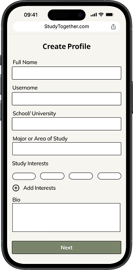
User Story 1: Profile Setup
Goal: "As a new user, I want to create a profile, so that other students can find me."
Access StudyTogether Web app
Sign up form
Profile creation page
Upload profile picture
Save profile/ confirmation message
Redirect to main dashboard
User Story 2: Sharing Content
Goal: “As a frequent user, I want to post helpful content so other students can learn from it.”
Login to StudyTogether
Navigate to feed
Scroll through content feed
Scroll through content feed
Create post form
Review Post
Post added to feed
User Story 3: Find Study Partners
Goal: “As a student, I want to connect with others in my subject so we can study together.”
Logged in student starts at dashboard
Navigate to find study partners
Filter study partners
View full profile
Send connection request
Low-Fi Wireframes
Laying down the bones for the Design
Whenever I create low-fidelity sketches, I treat them as a flexible starting point — not a final product. My goal at this stage is to get a rough sense of how everything might function, knowing that things will likely evolve once I move into mid-fidelity. It’s about laying down the bones of the experience, fast and loose, so I can focus on structure before getting into the details.
1. Onboarding Screens

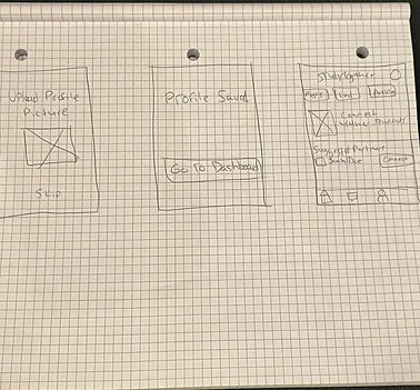
2. Find Study Partners

3. Feed & Create Post

Mid-Fi Wireframes
Refining the Blueprint
Here, I built on my sketches to explore layout, structure, and flow in more detail. This stage helped me test interactions without focusing on visuals just yet. I kept things flexible, knowing I’d refine spacing, hierarchy, and visuals in the high-fidelity stage.
1. Onboarding Screens


2. Find Study Partners

3. Feed/Create Post

UI Direction Update
Shifting the Palette to Match the Vision
I originally went with a muted green palette to create a sense of calm and relaxation, something I thought that overwhelmed students would appreciate. But over time, the colors felt too pale and dull. They lacked the vibrancy I needed to make the app feel alive. I shared the early designs with a few people and asked for honest feedback. While they liked the structure and layout, a common critique was that the colors felt flat and uninspiring. Instead of feeling relaxed, the muted tones made the app feel kind of boring — even clinical. With that said, I shifted to sky blue and orange for more contrast and emotion: blue for clarity and trust, orange for energy and warmth, giving the end result that polished and friendly feel I was looking for.
From This...


To This


Final Thoughts on the Redirection
This redesign marked a major turning point in bringing StudyTogether to life. By shifting from a muted green palette to a brighter sky blue and orange, the app transformed from feeling flat and clinical to warm, energetic, and motivating. These UI updates didn’t just improve aesthetics, they aligned the interface with the emotional tone I wanted users to feel: clarity, focus, and encouragement. The improved layouts, stronger color contrasts, and refined hierarchy all work together to create a more engaging and supportive study experience.
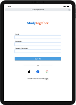
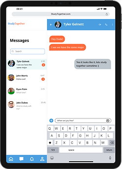
Responsive Design
Designing for all devices to cater for student needs
Students study in all kinds of settings — on their phones, laptops, or tablets. I made sure StudyTogether feels natural to use no matter the device, so users can stay focused, not frustrated.


StudyTogether Style Guide
Typography
Typography
Heading 1
Bold - 24px
Heading 2
Semi Bold - 18px
Paragraph 1
Regular - 16px
Paragraph 2
Regular - 14px
Paragraph 3
Regular - 12px
Color
Hex #4B9FE1
Hex #FF6B3B
Hex #000000
Hex #FFFFFF
Hex #EBF9F9
Hex #2F81E5
Hex #CAD6DF
Imagery & Illustrartions


UI Elements
Nav Bar
Tab Bars
Checkboxes
Profile Pics

Icons

Brand
Text Logo: For responsiveness & versitality
Font: Quattrocento
Color: Hex #4B9FE1 & #FF6B3B
Size: 30 pt
Reflection
How feedback, color, and iteration helped refine both the product and my process.
Designing StudyTogether taught me just how impactful the right color palette can be. I started with a muted green to convey calm, but feedback revealed it felt dull and didn’t match the app’s energetic purpose. Switching to a sky blue and orange palette brought the vibrancy and motivation I was aiming for—and reminded me how critical it is to test assumptions through feedback.
I also gained a deeper appreciation for the power of iteration. Moving from low to high fidelity helped refine not only the visuals but the usability and clarity of the interface. Each round taught me to make more intentional decisions and to stay open to change.
Overall, this project showed me that great design isn’t just about how something looks—it’s about how it makes users feel. It pushed me to grow creatively, think more critically, and embrace feedback as part of the process.